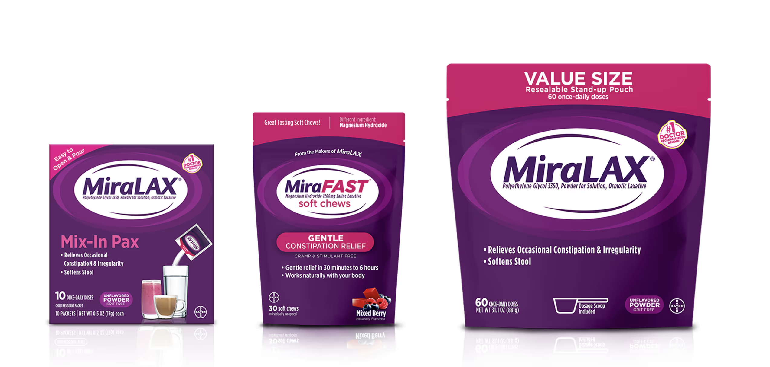
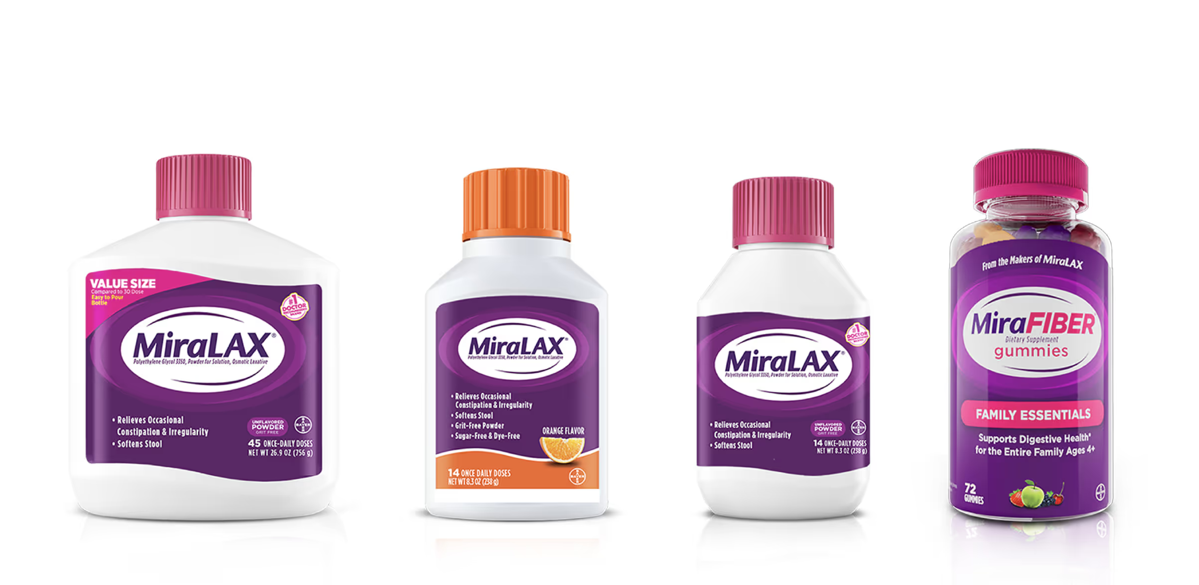
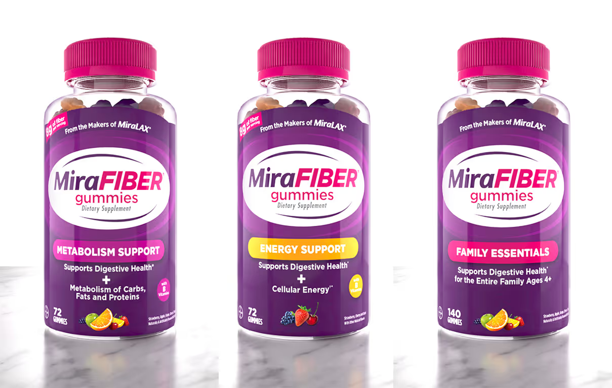
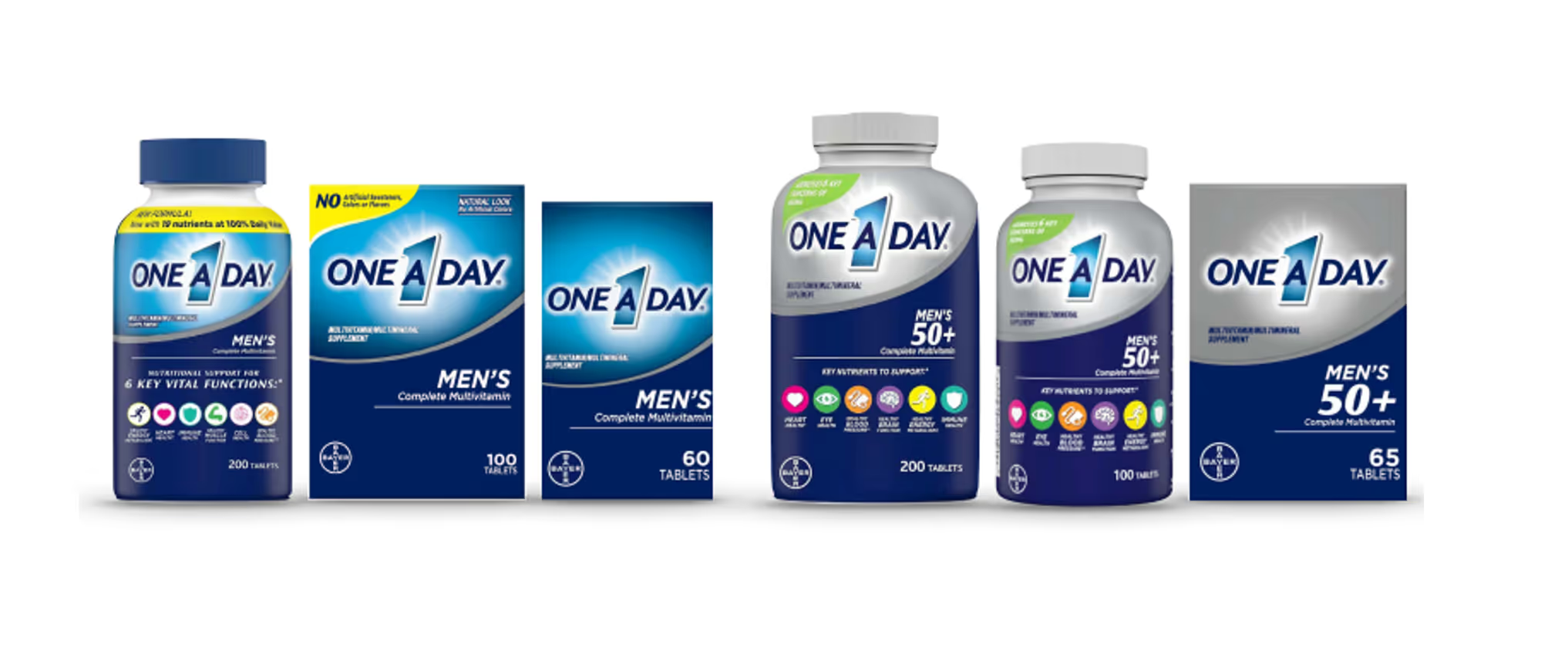
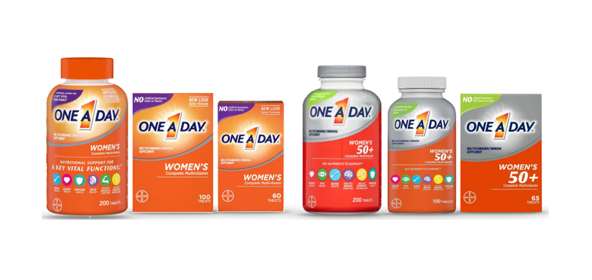
The below projects involved a comprehensive redesign of the product packaging, focusing on enhancing the brand's visual appeal and functionality. The goal was to modernize the look while maintaining the core elements of the existing brand architecture, ensuring consistency across all touchpoints.


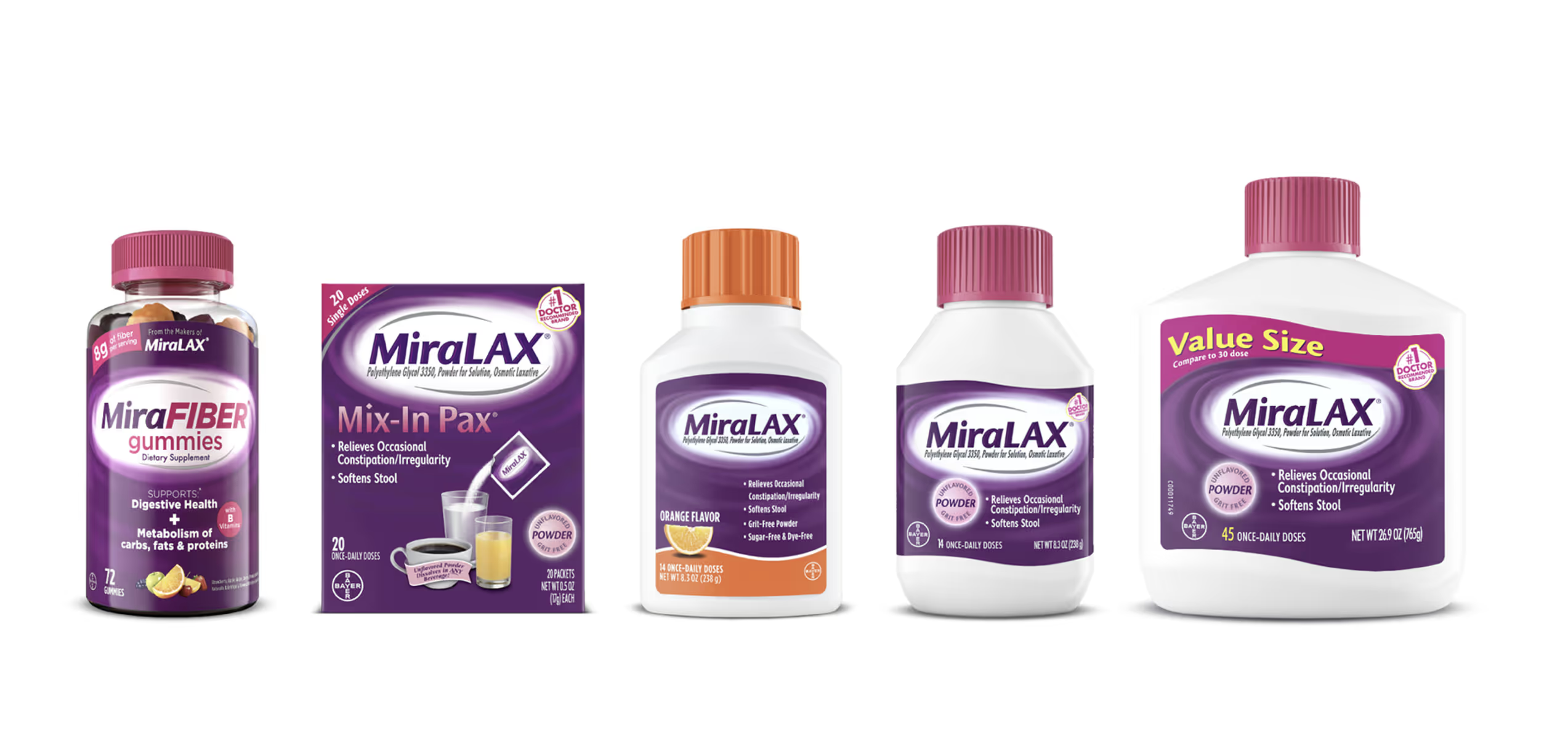
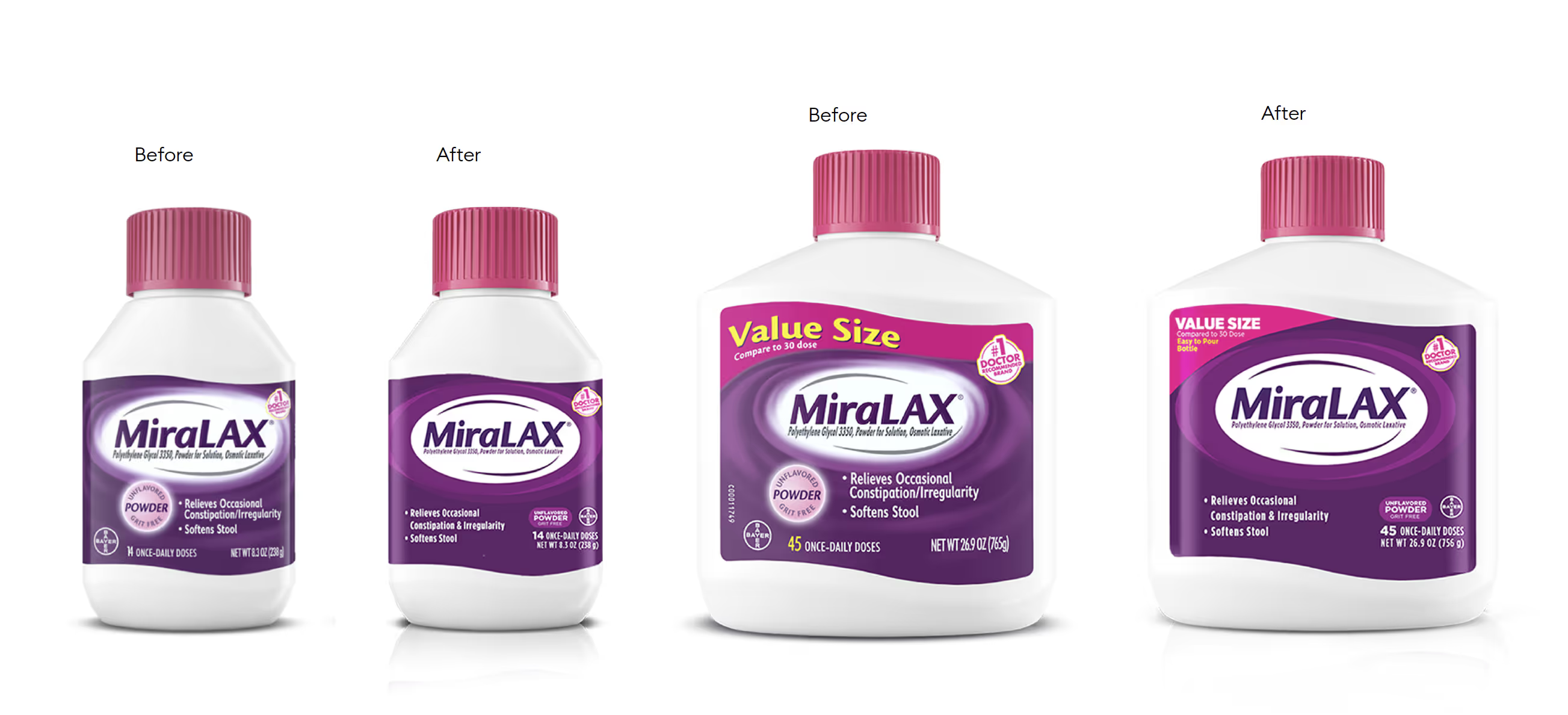
The redesign focused on simplifying the MiraLAX logo by removing the swirl and adopting a more graphical approach. This created a bold, bullseye effect that enhances shelf visibility, making the product stand out. The removal of gradients improved print quality, ensuring a cleaner and more consistent appearance across all packaging. Additionally, the copy layout was streamlined for easier readability, allowing consumers to quickly understand key product information.
