Brand identity, packaging innovation, and design system for two new products driving over half of MiraLAX's retail growth.
I led brand identity and packaging for both MiraFIBER and MiraFAST — the two products driving over half of MiraLAX's retail growth. Recreated the logo to be simpler and more impactful at shelf. Built a modular design system with MiraFIBER, then replicated it at speed for MiraFAST — inception to design lock in 3 weeks.
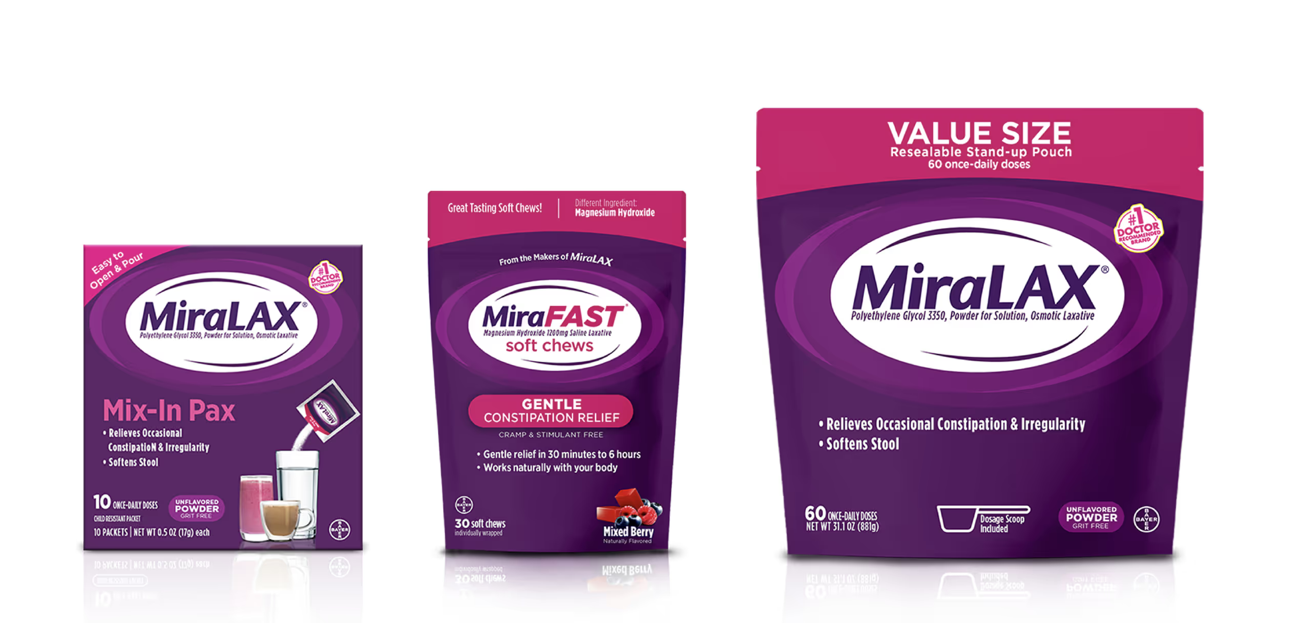
MiraLAX is a billion-dollar brand, but its growth had plateaued. The strategy was line extension — two new products that could capture adjacent consumer needs (fiber supplementation and fast-acting relief) while leveraging MiraLAX's existing shelf presence and brand equity. The challenge: create two distinct brand identities that felt unmistakably part of the MiraLAX family while standing on their own at shelf, in ecommerce, and in advertising.
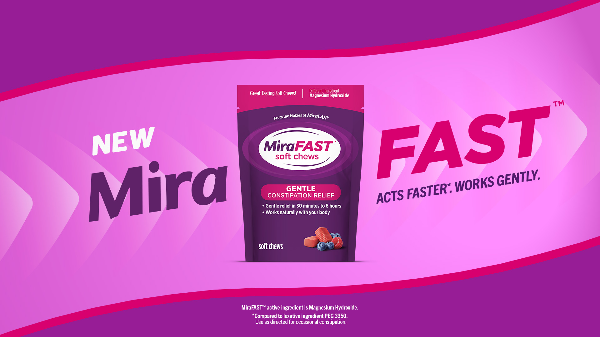
MiraFIBER came first, with a full development cycle. MiraFAST followed under extreme time pressure — inception to design lock in three weeks. The design system I built for MiraFIBER had to be modular enough to replicate at speed without sacrificing quality.
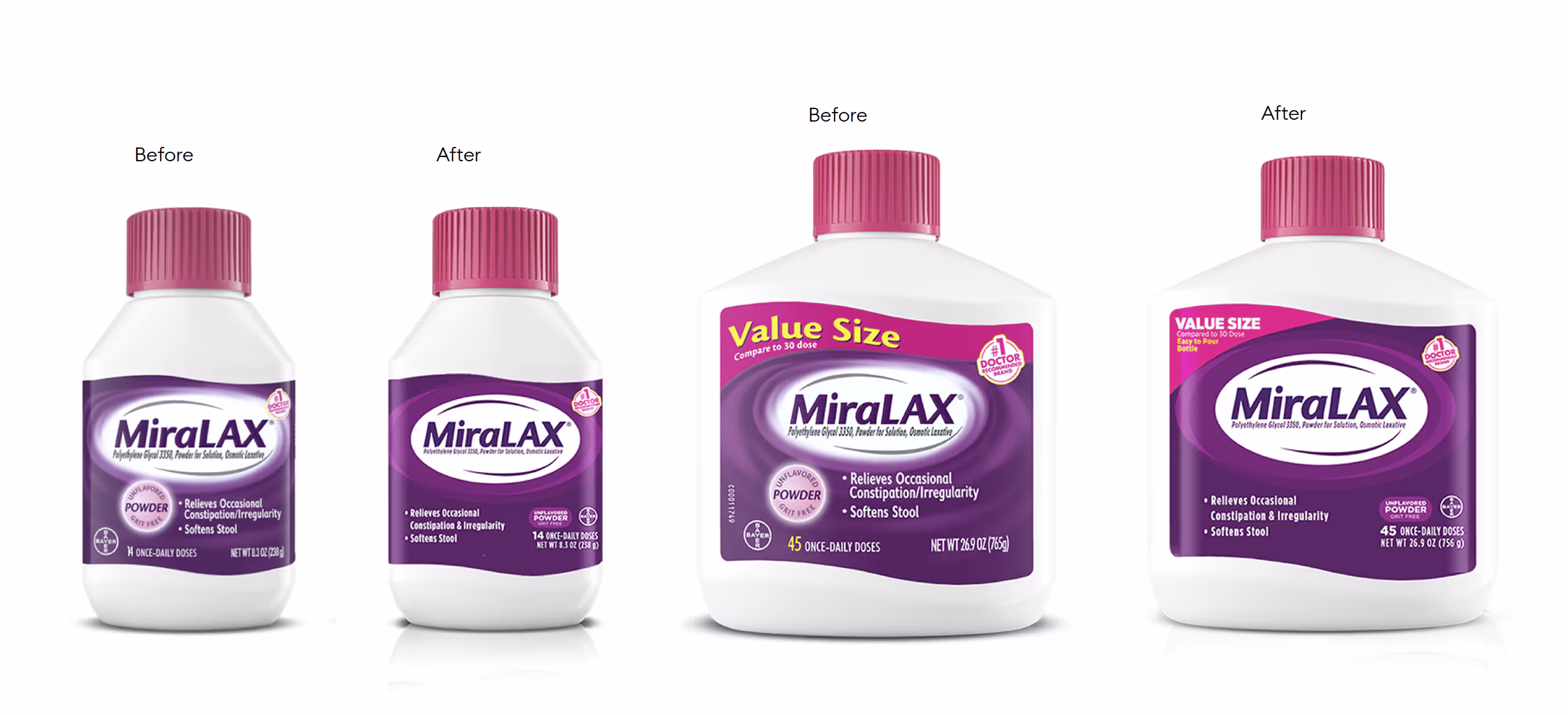
I started by redesigning the MiraLAX logo itself — simplifying the letterforms to be more legible at small scale and more impactful at shelf distance. This updated logo became the foundation for both sub-brands.
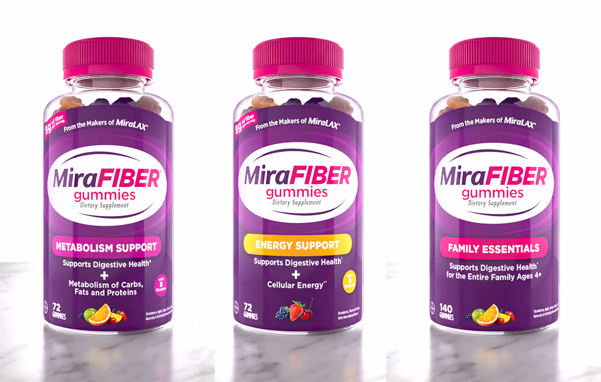
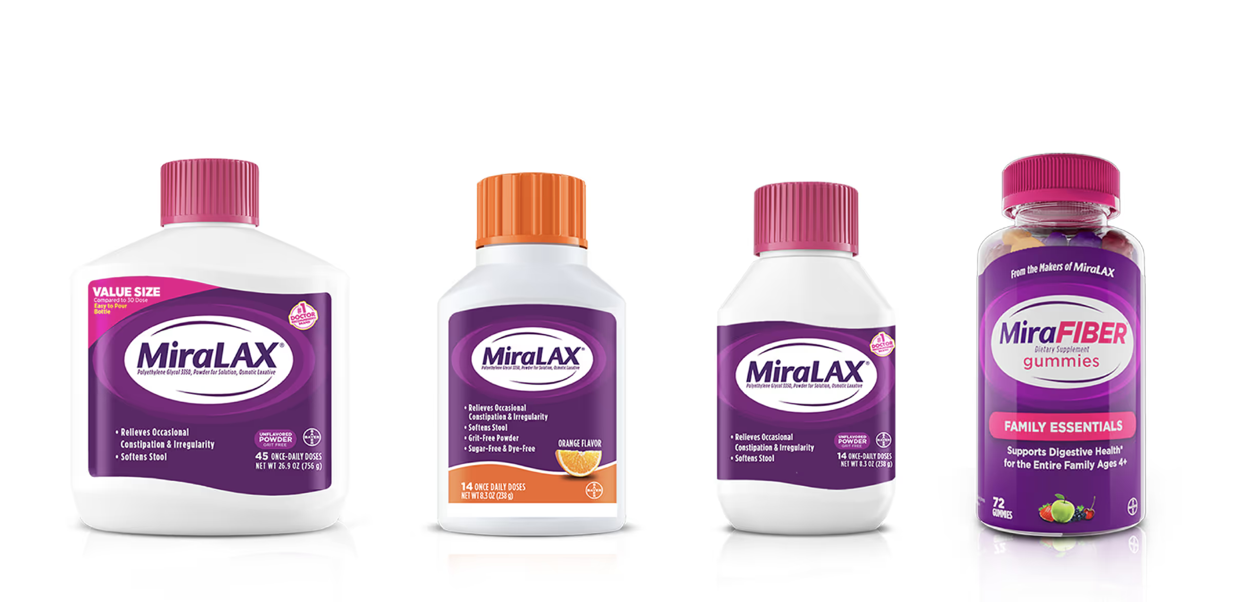
For MiraFIBER, I developed a complete brand identity system: color palette, typography hierarchy, packaging architecture, and a set of brand world visuals that could flex across cartons, bottles, digital ads, and retail displays. The system was intentionally modular — every element was built as a component that could be recombined for different SKUs, sizes, and formats.
When MiraFAST was greenlit three weeks before design lock, that modularity paid off. I adapted the system — new color story, distinct product photography, unique graphic elements — while keeping the structural framework intact. The result was a second brand that felt related but differentiated, delivered on an aggressive timeline.
Simplified the MiraLAX wordmark for improved legibility at shelf scale. The updated logo anchors both sub-brand identities.
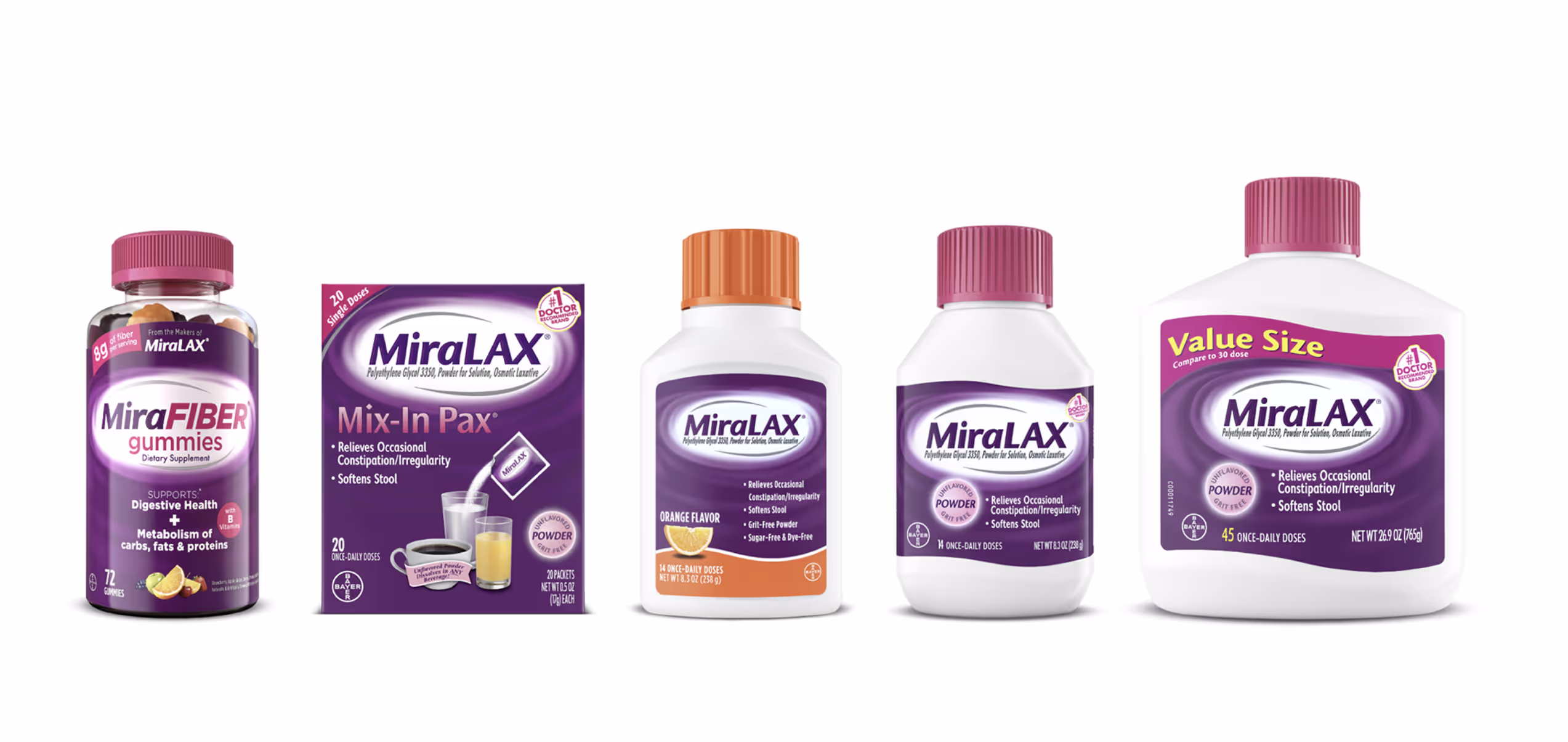
The full MiraFIBER product line — multiple SKUs across formats, all built from the same modular design system. Each variant maintains brand coherence while differentiating by flavor and format.
The original MiraLAX packaging before the redesign. Comparing this to the new system shows the shift in shelf presence — cleaner hierarchy, stronger brand block, more confident typography.
Visual brand world concepts extending the MiraFAST and MiraFIBER identity systems into advertising, digital, and retail environments.
MiraFIBER and MiraFAST combined have generated $37M in retail sales in 2025, with $67M projected for 2026. Together they account for over half of MiraLAX's total brand growth — making them the most significant line extensions in the brand's history. The modular design system I built continues to scale as new SKUs and formats are introduced.
Lead designer for both MiraFIBER and MiraFAST. Responsible for the MiraLAX logo redesign, brand identity systems, packaging architecture, design system creation, brand world visuals, and graphic innovation across all SKUs and formats. Built the modular system that enabled the three-week MiraFAST turnaround.